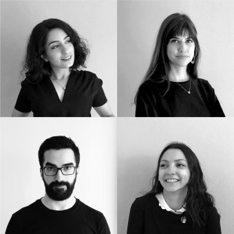
Kenarköse Creative
TURKEY
Meet Kenarköse Creative - a powerhouse of good design, creativity and innovation based in Turkey. Kenarköse Creative's design journey has been nothing short of spectacular, marked by a tireless pursuit of excellence. This dedication is clearly mirrored in Kenarköse Creative's impressive haul of 2 A' Design Awards that we showcase here. Spanning across categories such as Graphic, Kenarköse Creative's work stands as a living testament to a steadfast commitment to design excellence, serving as a beacon of inspiration for designers globally. With each project, Kenarköse Creative masterfully blends form and function, crafting designs that are not only aesthetically pleasing but also functional and timeless. This approach underscores Kenarköse Creative's celebration of creativity and an unyielding quest for innovation.
View Profile Consult Now Hire NowFor the 20th year of ODTU Sanat, an annually held art festival by Middle East Technical University, the request was to build a visual language to highlight the consequent 20 years of the festival. As requested, the 20th year of the festival was emphasized by approaching it like a covered art piece to be unveiled. Shadows of the same colored layers that form the numbers 2, and 0 created a 3D illusion. This illusion gives the feeling of relief and the numbers look like they melted into the background. The vivid color choice creates a subtle contrast with the tranquility of the wavy 20.

|
|
The logomark of Tualcom is inspired by the radiofrequency waves, which is related to the field that the company operates, and it simply connects the letters of Tual. Therefore, the logo not only emphasizes the company name but also refers to the operation fields of them. The branding is shaped around the idea of horizontal red stripes that are coupled with vertical blue ones to achieve a sense of continuity and communication. The resulting graphic language and the visual system instantly communicate with the broad audience compactly and efficiently.

|
|