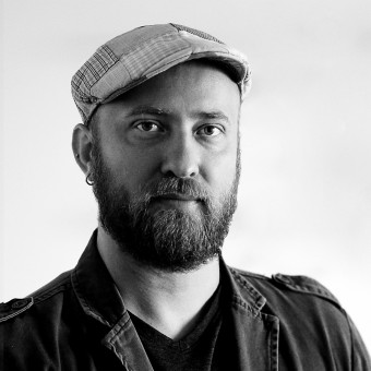
Mateus Matos Montenegro
BRAZIL
Meet Mateus Matos Montenegro - a powerhouse of good design, creativity and innovation based in Brazil. Mateus Matos Montenegro's design journey has been nothing short of spectacular, marked by a tireless pursuit of excellence. This dedication is clearly mirrored in Mateus Matos Montenegro's impressive haul of 6 A' Design Awards that we showcase here. Spanning across categories such as Graphic, Mateus Matos Montenegro's work stands as a living testament to a steadfast commitment to design excellence, serving as a beacon of inspiration for designers globally. With each project, Mateus Matos Montenegro masterfully blends form and function, crafting designs that are not only aesthetically pleasing but also functional and timeless. This approach underscores Mateus Matos Montenegro's celebration of creativity and an unyielding quest for innovation.
View Profile Consult Now Hire NowWith the challenge to deliver a family owned handcrafted quality 100 percent Arabica coffee to be accessible to everyone's essence, styles, tastes, preferences and faces. Soul is at the heart of pluralism and diversity, appropriating that for the purpose of a lighter, younger and more inclusive communication and design. A brand designed to transform and interact, creating an unlimited number of faces and textures, bringing up the whole concept of the brand's diversity. Soul is in the essence of coffee; it is coffee with a soul.

|
|
The inspiration for the brand rethinking and redesign were the changes in modernization and integration in the company’s culture. The design of the heart could no longer be external to the brand, inspiring a partnership both internally with employees, but also with customers. An integrated union between benefits, commitment and quality of service. From the shape to the colors, the new design integrated the heart in to the B and the health cross in the T. The two words joined in the middle making the logo look like a one word, one symbol, uniting the R and B in the heart.

|
|
The design for EXP Brasil brand comes from the companys principles of unity and partnership. Appropriating the mixture between technology and design in their projects as in the office life. A typography element represents the union and strength of this company. The letter X design is solid and integrated but very light and technological. The brand represents the studio life, with elements in the letters, both on the positive and negative space that unite people and design, individual and collective, simple with technological, lightweight and robust, professional and personal.

|
|
Meat n Beer is considered a flagship store selling specialty meats and beers. The inspiration for the logo came from the merging of their two flagship products. From traditional cattle heads with their pointed horns, transformed with an iconic design in a modern rustic wire frame vector, interacting with the other traditional element, the beer bottle. The union is in a positive and negative space, succinctly and elegantly into a single symbol where text and image form a single image. The typography plays and mixes an old style Industrial font with a more modern Script.

|
|
A brand that translates family history. Coffee, family, 7 children and Mr Tunico. These are the pillars of this story, and that is what the logo translates. The coffee design discreetly replaces the i dot; the inseparable companion hat represents Mr Tunico; the typography represents family tradition and the handcraft way of coffee production. A seal design is to identify the brand quickly when applied into various places and objects with the use of the T, initial letter of Tunico, his hat and the 7 grains around, representing the 7 children to whom he passed the legacy of his lands and crops.

|
|
The SETMA, Municipal’s Tourism and Environment Secretariat of Jijoca de Jericoacoara, brand represents the harmonious landscape and natural wonders of the city, from the Blue Lagoon, the Serrote, the Pierced Stone, the Sea and the iconic Sunset on the Dunes. The designer unified all these elements in a harmonious form with the use of sine waves curved elements, which represent the frequency, balance and equilibrium between all the natural beauty and experience the city provides, deemed beautiful by their residents and many visitors around the world.

|
|