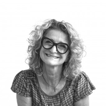
Laura Ferrario
ITALY
Meet Laura Ferrario - a powerhouse of good design, creativity and innovation based in Italy. Laura Ferrario's design journey has been nothing short of spectacular, marked by a tireless pursuit of excellence. This dedication is clearly mirrored in Laura Ferrario's impressive haul of 5 A' Design Awards that we showcase here. Spanning across categories such as Graphic and Packaging, Laura Ferrario's work stands as a living testament to a steadfast commitment to design excellence, serving as a beacon of inspiration for designers globally. With each project, Laura Ferrario masterfully blends form and function, crafting designs that are not only aesthetically pleasing but also functional and timeless. This approach underscores Laura Ferrario's celebration of creativity and an unyielding quest for innovation.
View Profile Consult Now Hire NowWeAre4810, WeAreFamily is the new concept used to relaunch the Brand. It becomes the container and symbol of all the group's activities. The use of highly contemporary and solid numbers conveys the feeling of certainty and contemporariness as the numbers can in their turn become containers of images. From Rental to Shopping and up to the true novelty the Food. WeAreFood is the space where every day is divided into 4 moments; a concept that is enhanced by the clock whose arms are a fork and a spoon. A clock that from the graphical point of view is a mix between present, past and future.

|
|
Just as the Iseo Lake splashes on the banks of Franciacorta, so the sparkling wine wets the sides of a glass. The concept is a graphic re-elaboration of the shape of the lake and expresses all the power of a Reserve bottle being poured into a crystal glass. An elegant and lively label, balanced in its graphics and colors, is a daring solution with transparent polypropylene and entirely hot foil gold printing to give new sensations. The pouring out of the wine is underlined on the box, where the graphics wraps around the pack: simple and impactful composed by two “slive et tiroir” elements.

|
|
DuePiùTre is a small bistrot offering Not just Hamburgers, but also pastrami and beer can chicken, all revisited with fresh and genuine Italian products. The bulldog was chosen because during the First World War it was the mascot of the United States Navy, and because it is the pet dog of one of the bistrot’s partners. To compensate for the invented name of the place, the design includes a chef’s hat for the bulldog and a pay-off that try to convey the idea of an establishment offering food in a more direct way.

|
|
Fattoria il Gambero placed itself on the market with a dynamic and contemporary approach, in order to enhance its own history, which dates back to 1880. This is the reason for the trademark of the stylized “G”; it conveys the sense of a corkscrew uncorking a bottle and resembles the road leading to the company. The sans serif font adds substance to this somewhat abstract symbol and links its ancient past inexorably to the present. The colors give the entire image an innovative touch, while certain characteristics of the past are preserved, for instance, in the embossed paper of the Brochure.

|
|
Le Coffret is a charming design bed and breakfast in the heart of Valle d'Aosta. The project was conceived in absolute respect of the authentic style: therefore the stone walls, wooden beams and antique furniture. A circle symbolizing the sky over the triangle representing the mountain, where the B&B is located, from the idea of the ascent of man into the sky. An Onciale font revised in a modern version to remember the Celtic origins of the Valley rightly balances and supports a strong and important symbol to finally obtain a logo that is easy to identify and easily catches the eye.

|
|